
How I made it: Letterpress Card for NY Metropolitan Museum of Art
/
I've recently finished illustrating and printing a custom letterpress card for the Metropolitan Museum of Art. I took inspiration for the illustration from a fabulous 16th century work from their upcoming exhibit: "The Royal Hunt: Courtly Pursuits in Indian Art".
Pivotal to the success of this project was the decades of letterpress expertise of my printer, Richard Seibert. For some special projects where the experience wants to be deeper or more complex than normal offset or digital printing, letterpress is a gorgeous tool. The process is also very rewarding: slow, careful, with thought put into every action. It can also be hair-pulling and tear-jerking at times! But when the images start to appear, just as you imagined them (or better than you imagined!), color by color, all the stress dissolves and you feel dang proud and happy.
In this article, I wanted to give a very quick overview of the entire process of creating this card, but focus in-depth on just one tiny aspect: the mixing of just one of the ink colors. This encapsulates the care put into the entire process and gives a great sense of the extreme time and attention to detail that letterpress printing (and any hand-printing technique) requires. I hope to explain the other aspects of letterpress printing in more depth in later posts.

Above is my inspiration image, entitled "Hamid Bhakari Punished by Akbar". What drew me to this wonderful 16th century painting were the flowing composition of the animals scattered by the hunter's charge: ordered yet fluid. I also loved the gorgeous colors. In this custom card I wanted to capture similar movement and feeling yet interpret the scene in my own particular style.
I first created the illustration, focusing on movement, color, and composition, refining until every line felt correct. Then I separated the illustration into its component colors, since letterpress printing requires each color be run through the press using a separate run. Then I went over to my neighbor and friend's studio, master letterpress printer Richard Seibert, and together we started work on producing the final letterpress card.
First, plates were made from my final illustration. One plate was created for each color of the card. The final card has four colors: red, gold, blue, and black (black for the text on the back), and so four plates needed to be made. Since each ink color requires a separate run through the press, this card required four press runs.

The red and the gold plates
First, I found the approximate shade of red I wanted in the Pantone color book. A Pantone book is a book of color swatches used as a guide for printers and designers. Each color comes with a mixing "recipe". The color I chose, Pantone 485, is made by mixing 8 parts Pantone Yellow with 8 parts Pantone Rubine Red. This is the same type of color system used at hardware stores which can mix you a can of house paint based on a variety of color swatches.

Identifying the initial red color... but it still needs a lot of work
However, one big drawback of the Pantone color system is that it just doesn't have very many colors. If you think about the wall of house paint colors at the hardware store, there might be 5 or so different shades of blue-green, but if none of those pre-mixed shades are perfect then you have no option but to choose the closest one.
If you want your image to match a special vision, the ink probably needs to be hand-mixed, and that means using the book only as a starting point and then using experience, intuition, and theory to create the final color. One of the (many) huge benefits of working with an artist like Richard is that he understands how important color is and so will patiently hand mix inks over and over again, making minute changes, until we're both happy with the final color. Not to say that we don't sometimes have spirited discussions over the particulars of colors and how they should best be mixed! Sometimes our opinions differ on slivers of difference I'm not sure would be very detectable to anyone who hasn't been staring at it for hours. But he is dedicated as I am to getting the right result and that's the kind of person I like working with.

A can of ink and a mixing knife
Hand-mixing inks is a physical job. Inks are mixed on a metal or glass surface and require a lot of blending with a stiff flat-bladed knife to thoroughly distribute the pigments.
Envisioning what final color you want while at the mixing table can be difficult, especially in projects with many colors. Printed on paper the colors will often interact with each other to produce different hues. I'm not just talking about colors on top of each other blending together, but colors side by side which alter your perception. So you have to plan ahead for that interaction when you're mixing the individual colors. Since the inks are printed one at a time, if you print an entire run of reds which are too blue, then all the subsequent inks on your entire job need to be tweaked to compliment the altered first color. However carefully you plan before hand, you can quickly veer off into the wilds of intuition. Every additional interacting color increases the stress exponentially. That can get really nerve-wracking when you have a job like my 8-color letterpress desktop calendar... talk about a challenging color-mixing project!

Mixing different reds-- using red, black, green, and yellow
Also, some inks have more transparent pigments than others, which makes mixing less straightforward. For example, adding equal parts of a red and a yellow will not make an orange: it will make a red that's so vaguely yellow-tinged that you wonder if you hallucinated adding yellow at all. So sometimes it takes a lot of trial and error to come up with the correct final color.
Another difficulty is that the color you see while mixing is NOT the color that will print. Letterpress applies the color very thinly onto the paper, so the resultant color is much lighter (and often a very different hue) than what you see on the mixing table. Applying the ink to the press, running the press, discovering you've mixed the wrong color, and then cleaning the whole press with solvents before starting over is a huge pain, takes a lot of time, and is rather demoralizing when it's getting on to dinner time and you're still trying to figure out the right red.

The drawdown test applied to a hand-mixed ink: the two reds are made from the same ink.
Luckily, there is a test called the "drawdown" test that approximates the final color without using the press. (That's what Richard calls it, anyway). While applying a lot of pressure on the mixing knife, you scrape the thinnest possible line of ink down a piece of white paper. Then, because this ink line will still be darker than the final printed ink color, you try to identify the lightest area of the ink line (usually just a little dot). Using crazy Wonder Woman powers of visualization, you try to block out the surrounding colors and visualize only that very lightest, very smallest spot in the line of ink, then try to visualize that color working with the other colors that will be printed on the card. It's not rocket science... and it's also not incredibly accurate. I find myself saying, "I dunno, Richard!" an awful lot. But it does at least give the right direction to go in.
The good thing (for me) is that Richard is incredibly experienced in visualizing things like this, and very patient, too.

More reds...
I thought the initial mixed color was too cherry red-- I wanted it more tomato-y red, and a little duller. Here's where another challenge arises: ever tried to describe a very specific color to another person? It's not that straightforward. Turns out, adjectives are open to a lot of interpretation. Enter patience and experience again, plus referencing the Pantone book ("can we bring the color more towards this swatch, but bring the saturation down to this swatch, and darken everything overall?") . Plus there's the interaction of the printing ink pigments, which follow their own bizarre logic (Did you know that a green can be made by mixing yellow and black inks?).

One of these is the red we want!
But, when we saw the (twentieth?) drawdown we both instantly knew it was the right color. Much high-five-ing was had by all. It had taken multiple hours to come to this color, but it was worth it. On to the press to print the red! And, after the red, we repeated this process with the other mixed colors (gold and blue). This project was truly a labor of love.
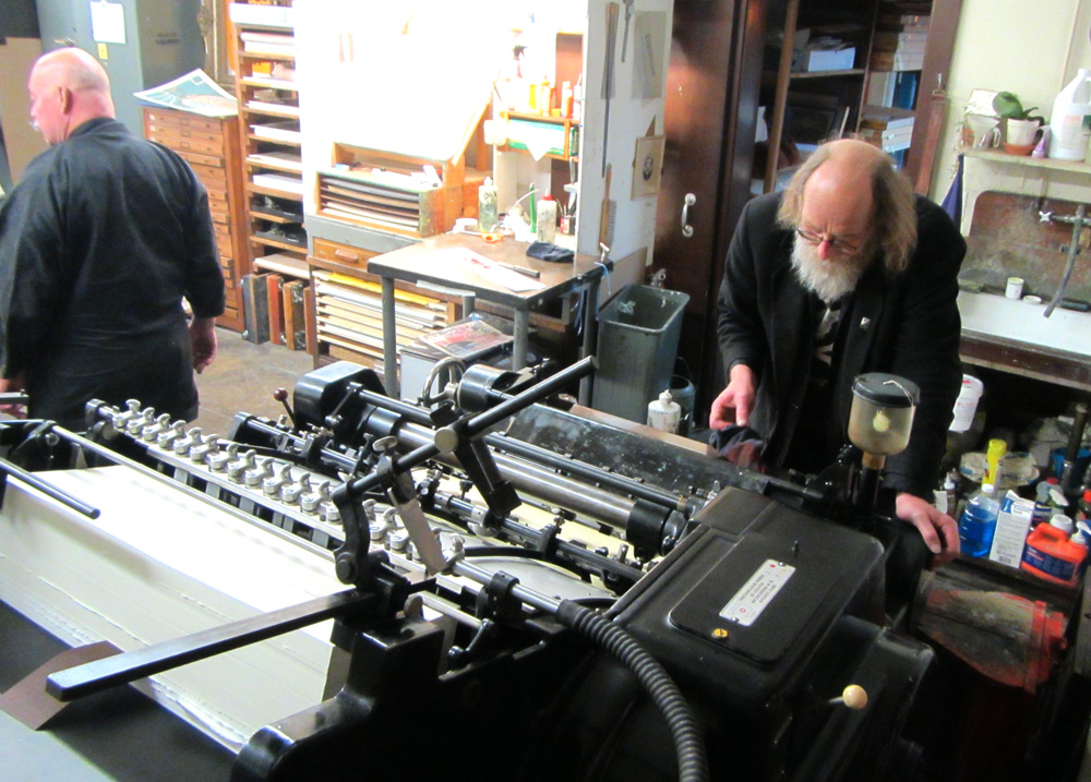
Below is Richard setting up the card for printing on his lovely Heidelberg cylinder letterpress. I can share details of the press in a later post, but for now suffice it to say it's a beauty of a machine from way back in the day and is a whirring, clacking, suction-cup-lever-wheel-gear-cast-iron, multiple-tonned incredible printing miracle. I am so pleased with the way this card turned out and am excited about the next project!
This card is available exclusively from the Metropolitan Museum of Art.
Exhibit information:
The Royal Hunt: Courtly Pursuits in Indian Art
June 20–December 8, 2015
The Metropolitan Museum of Art
www.metmuseum.org